Creative Review
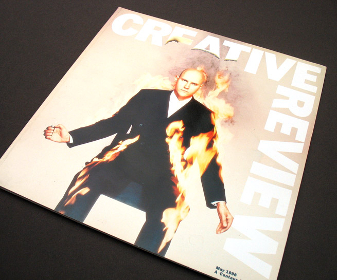
I was the art director of Creative Review for around three years in the late 1990’s. During this time I undertook a redesign. Creative Review has a very identifiable square format, which we decided to keep. We used this image of Simon Costin for the cover of the relaunch issue, which was very effective.
Sixteen years of portfolio changes and a gradual move into more digital environments means I don’t have any more samples from CR to view, but the magazine itself continues to go from strength to strength, I’m pleased to say.
Tasks
- Art direction and design of the monthly magazine

